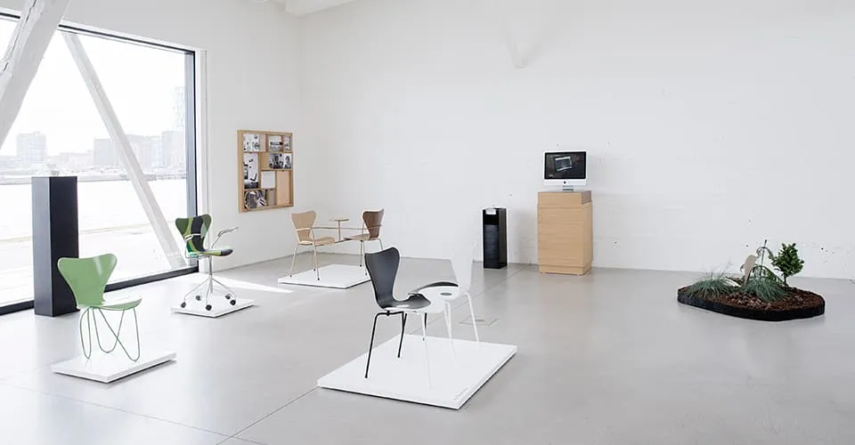
When Fritz Hansen invited 7 internationally well-known architects to interpret the Series 7™ into new contexts, there were few rules attached. The architects accepted the invitation and for the remains of the year the results will be exhibited all around the world – from London to Tokyo. By the end of the project the chairs will be sold on auction for support of Unicef’s work.

7 architects and 7 contexts
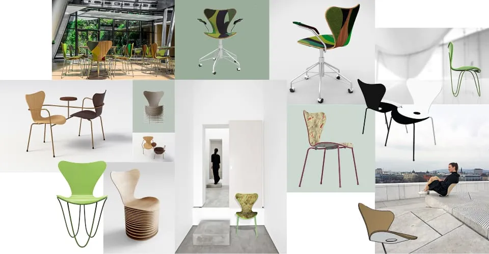
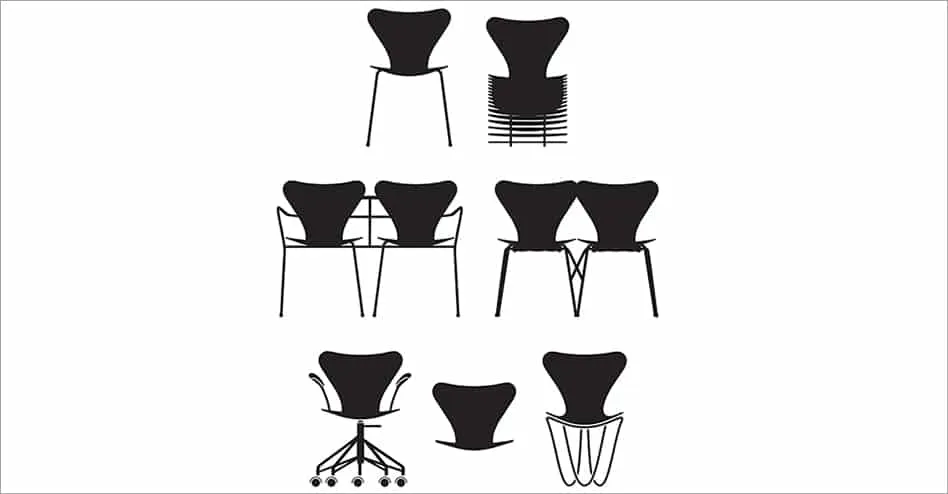
Jean Nouvel, BIG, Zaha Hadid, Snøhetta, Carlos Ott Architects in association with Carlos Ponce de León, Jun Igarashi Architects and Neri & Hu. Each of them were asked to decide upon a context and design a version of the Series 7™ for that particular place. Legs have been changed, material and surface of the shell have been redesigned. The function varies from a seat in nature to a tête-à-tête double faced chair – all revealing completely new ways of adapting the iconic design into new contexts.
The Seven versions of the Series 7™ chair
Seven international architects have made their interpretation of the iconic Series 7™ chair designed by Arne Jacobsen.
Carlos Ott Architects in association with Carlos Ponce de Léon Architects
Celebra, a flagship building of the technological campus Zonamerica was the context for the design. “We decided to merge the chair and the building seamlessly with the restaurant. The chairs should be intervened the same way the vertical garden grows organically up the wall in the open-roof basement: The upholstery climbs and settles peacefully on the shell of the chair. The curved lines which compose the foundation of the different areas in the garden are mimicked and adapted to the anatomy of the chair”.

Jun Igarashi Architects
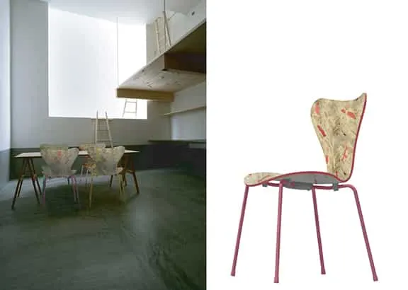
Context: When buildings collapse during earthquakes the building materials are wasted. The idea is to collect the waste wood, introduce a colour and process it into boards that can be used for furniture.
Design: “In our work we have chosen the context of the wooden houses “house M” and “rectangle of light”. The unique qualities of the spaces are created by the sophisticated work with light and shadow forming a very quiet space. The quietness leaves room for the strong history of the making of the chair”.
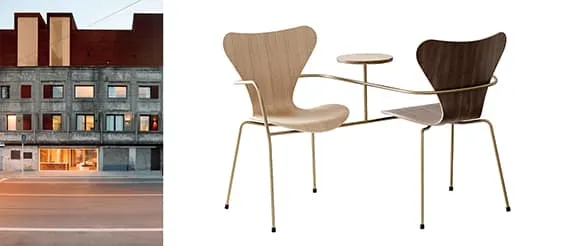
Neri&Hu Design & Research Office
The Waterhouse from 1930s in Shanghai was the context for this design. The idea of a replica, a re-edition hinges on the duality between the original and the re-design, such as it is also seen in the renovation of The Waterhouse. Our take on this project is to embrace this exact idea of duality and create an actual “double”. The doubling of two original seats facing each other becomes the new version: The singular chair multiplied as the individual becomes a community. Reminding us that we are never alone, but always together.
Snøhetta
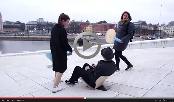
“Rauland Mountain Church is placed on a slope on a balance point. The chair and the church have similar qualities. We envisioned that the chair would be fixed to its legs inside, and with the church being located on a ski slope you could click off the shell and bring it onto the slopes for an outdoor service. Since we set the chair free, we felt that the chair could be used for a large number of our projects. We try to maintain a good link to the outdoors through out our work and that’s why a outdoor chair is perfect for our projects”.
In this short movie Snøhetta explains how they worked with the design and chose to explore the shell by removing everything else.

Zaha Hadid
This special edition formalises the Series 7™ chair as a dynamic and seamless expression of structure and support. Formed from two continuous steel rods, the sculptural base sweeps down to the ground and reaches up to embrace the undulating shape of the iconic plywood seat.

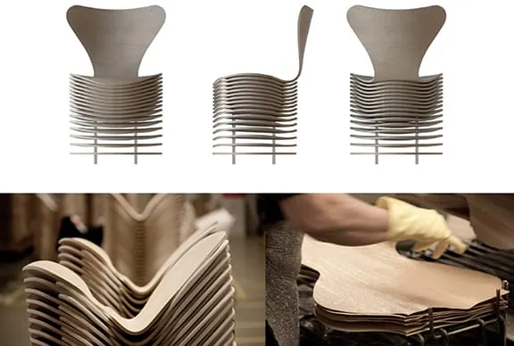
Bjarke Ingels Group
The inspiration for the design is the materiality of the chair. The essence of the layered veneer and the functionality of the stacking. The final result is a subtle repetition of the iconic form language.
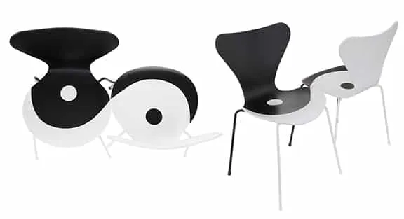
Jean Nouvel Design
The design is an example of Jean Nouvel’s design signatures – contrasting colours and juxtapositions. Black and white mark each chair – although they still play together in a feminine and masculine flow. Creating a reinforcement of the curves of the front and of the back of the shell.
Why re-invent the Series 7™?
To Fritz Hansen timeless design is all about presence. Arne Jacobsen designed the Series 7™ in 1955 and very unlike his other designs he didn´t design the chair for one specific purpose like he designed the Ant™ for the canteen of Novo Nordisk in Denmark or the Oxford™ chair to St Catherine’s College in Oxford.
Today the Series 7 stands out as particularly capable of adapting into still new situations and contexts. “But if we fall asleep on top of our heritage design become museum-items. And if that happens it no longer adds new value to the present time”, CEO Jacob Holm recently expressed. Curiosity and willingness to challenge form and function is what it takes to turn high quality into very strong design.
Next steps in the project
For the remains of the year the chairs will be exhibited all around the world, with a preview in London and Copenhagen and with a world premiere in Belgium. Two copies of each chair will be sold on an auction at the end of the year. The auction and the exhibition program will be announced in this newsletter and in the press during the coming year.
More designs from Fritz Hansen:
A Q&A with Kasper Salto about the Vind Series
THE VIND SERIES A Q&A with Kasper Salto about the Vind Series The Vind Series …
Fritz Hansen celebrates 100 years since the birth of Verner Panton
SERIES 7™ – VERNER PANTON 100 A LASTING LEGACY SERIES 7™ – VERNER PANTON 100: …
Vind Series design by Kasper Salto for Fritz Hansen
Fritz Hansen proudly presents the Vind Series of outdoor furniture by Danish designer Kasper Salto. …
Fritz Hansen introduces a curated upholstery textile selection for 2026
Fritz Hansen is delighted to introduce a newly curated selection of upholstery textiles for 2026 …

Poul Kjærholm Born This Day 1929: Pioneer of Steel in Danish Design
Born on 8 January 1929, Poul Kjærholm is known for his precise, material-driven approach to …

Little Giraffe™ by Arne Jacobsen: Fritz Hansen
Fritz Hansen has launched Little Giraffe™, a previously unreleased prototype designed by Arne Jacobsen in …

Let Lounge Chair Swivel Base by Sebastian Herkner for Fritz Hansen
The Let™ Lounge Chair by Sebastian Herkner is now available with a swivel base —bringing …
Series 7 Tailored — Arne Jacobsen’s Icon Reinvented by Fritz Hansen
Fritz Hansen presents the Series 7 Tailored A crafted version of the iconic plywood chair, …
After Series by Michael Anastassiades
Fritz Hansen is pleased to announce the launch of the After Series by Michael Anastassiades, …
PK23 lounge chair by Poul Kjærholm
Introducing the front-upholstered PK23™ lounge chair by Poul Kjærholm an homage to the early career …
PK3, a previously unrealised by Poul Kjærholm | Fritz Hansen
Fritz Hansen Unveils Lost Poul Kjærholm PK3 Chair from 1954 Fritz Hansen proudly introduces the …
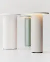
Fritz Hansen is proud to launch Solae Portable Lamp design by Cecilie Manz
Solae Lamp by Cecilie Manz for Fritz Hansen | Design News Fritz Hansen is proud …
Fritz Hansen Shaping Lasting Design @ 3daysofdesign
At this year’s 3daysofdesign, Fritz Hansen presents Shaping Lasting Design – a celebration of 153 …

Series 7™ Chair with Limited Morning Light Collection | Fritz Hansen
To celebrate seven decades of Arne Jacobsen’s iconic chair, Fritz Hansen is releasing limited edition …
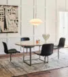
Poul Kjærholm’s PK54™ dining table in a new height
Iconic Design Meets Modern Functionality Fritz Hansen now presents Poul Kjærholm’s legendary PK54™ dining table …
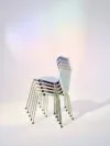
7:14 AM is Fritz Hansen’s new colour palette inspired by the Danish morning light for the Series 7™ chair by Arne Jacobsen
During 2025 Fritz Hansen is celebrating seven decades of the Series 7 chair, a Danish …
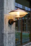
The HL Wall outdoor lamp has been a beacon of stately elegance since 1975 by Henning Larsen – Fritz Hansen
The HL Wall outdoor lamp has been a beacon of stately elegance since 1975, warmly …

The Clam™ Portable lamp introduces a versatile new dimension to the Clam™ series, by Ahm & Lund – Fritz Hansen
The Clam™ Portable lamp introduces a versatile new dimension to the Clam™ series, blending form …
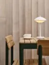
The Pelagus series expands with four new tables, stackable counter and bar stools by Note Design Studio – Fritz Hansen
The Pelagus series brings spaces to life with a minimalist contemporary aesthetic and enduring, highest-quality …
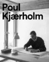
Born 8th January 1929, Danish designer Poul Kjærholm referred to himself as a “furniture architect”
CLEAR, SIMPLE AND ELEGANT Born 8th January 1929, Danish designer Poul Kjærholm referred to himself …

PK23™ lounge chair design by Poul Kjærholm for Fritz Hansen
A VISION BROUGHT TO LIFE Fritz Hansen is pleased to announce the launch of the …
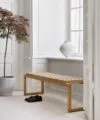
25th anniversary Cutter Bench by Niels Hvass – Fritz Hansen
Celebrate the 25th anniversary of the iconic Cutter Bench by Niels Hvass To celebrate the …

Fri sofa by Jaime Hayon – Fritz Hansen
When Jaime Hayon created the Fri™ lounge chair and stool, he looked to embody openness, …
The Caravaggio™ Lamp in new colours design by Cecilie Manz
Cecilie Manz’s Caravaggio pendant for Fritz Hansen instantly achieved design icon status when it launched …
Grand Prix™ chair special editions by Arne Jacobsen – Fritz Hansen
A BOLD NEW LOOK Fritz Hansen proudly presents Grand Prix™ Editions – a curated range …

PK23 armchair from Poul Kjærholm by Fritz Hansen
In a dedicated area, the spotlight was turned on the masterpieces of Poul Kjærholm – …
The Pouf in new colours and textiles design by Cecilie Manz – Fritz Hansen
CREATIVE COMBINATIONS The elegant CM Pouf series is updated with new colourways and textile combinations, …

New additions to the Analog™ series design by Jaime Hayon – Fritz Hansen
Jaime Hayon’s Analog table was first created for Fritz Hansen in 2014. A decade later, …

Monolit by Cecilie Manz | Fritz Hansen
The Monolit chair by Cecilie Manz is a pure expression of an upholstered chair, supremely …

Pluralis™ Office Table Series by Kasper Salto | Fritz Hansen
The extended Pluralis™ table series offers versatile solutions for meetings of all sizes, online and …
Fritz Hansen is releasing China Chair by Hans J. Wegner
ANNOUNCING 80 X 80: AN ANNIVERSARY EDITION OF THE CHINA CHAIR BY HANS J. WEGNER …
Clam™ lighting by Ahm & Lund | Fritz Hansen
INTRODUCING NEW CLAM™ FLOOR AND TABLE LAMPS A PEARL OF LIGHT Fritz Hansen extends the …
Fritz Hansen proudly presents a special edition of the stylish Swan™ chair by Arne Jacobsen
FRITZ HANSEN CHOICE 2024 Fritz Hansen proudly presents a special edition of the stylish Swan™ …

Plenum™ Cabin by Jaime Hayon – Fritz Hansen
MEET YOU THERE Introducing the Plenum™ Cabin, an exceptional creation designed for Fritz Hansen by …

AJ Trolley™ now in walnut by Arne Jacobsen – Fritz Hansen
The AJ Trolley™ is an authentic piece of Danish design heritage now available in walnut …

Kaiser idell Wall Lamp – Fritz Hansen
FOREVER MODERN Introducing the KAISER idell™ Wall Lamp, a premium lighting design with an industrial …

A playful expressive design Utzon Stool by Jørn Utzon – Fritz Hansen
Introducing the Utzon Stool by Jørn Utzon SYMPHONY OF IMAGINATION A playful expressive …
Rocking Horse carries a unique sculptural expression | Fritz Hansen
Rocking Horse carries a unique sculptural expression and a compelling origin story The Curious Horse …

Georg Stool 10th Anniversary Exhibition in Copenhagen
Fritz Hansen celebrates 10 years of the Georg Stool with an exhibition and charity sale …
Fritz Hansen is releasing a limited production of 150 Egg chairs
Introducing The Collector’s Edition Egg Chair On November 1st Fritz Hansen is releasing a limited …
Avion design by Iskos-Berlin for Fritz Hansen
The Avion™ is inspired by a childhood fascination with aircraft – in particular, Zeppelin airships …
Little ones design by Arne Jacobsen – Fritz Hansen
GOOD DESIGN IS FOR EVERY AGE Introduce the little ones to a lifetime of beautiful, …

Night Owl Table Lamp: Wiig Hansen’s Nordic Vision for Fritz Hansen
LIGHT UP IMAGINATIONS The distinctively Nordic feel of the Night Owl table lamp adds a …

Designer Piero Lissoni Extends Acclaimed Series for Fritz Hansen
Fritz Hansen now offers a complete series of the timeless lounge furniture with the introduction …

Cecilie Manz’s Minimalist Taburet Stool Joins Fritz Hansen Collection
The new Taburet stool by Cecilie Manz reveals a versatile design highlighting beauty in precision …
Mette Schelde’s Minimalist MS Lamps Join Fritz Hansen Lighting Portfolio
Introducing a cool, clean aesthetic to living and working spaces with the new MS series …
Fritz Hansen Presents Poul Kjærholm’s PK15 Chair: A Woodworking Masterpiece
Fritz Hansen is proud to introduce the PK15 chair by Poul Kjærholm, the last chair …
Poul Kjærholm’s Masterpieces PK22 and PK33 Return in Exclusive Fritz Hansen Edition
PK22 & PK33 SPECIAL EDITION The PK22™ chair exemplifies Poul Kjærholm’s vision for the ideal …

Special Edition Egg chair Homage to Arne Jacobsen | Fritz Hansen
The F.H. Choice 2023 pays homage to Arne Jacobsen with an exclusive special edition of …

Presenting front upholstery for the Ant™ chair by Arne Jacobsen – Fritz Hansen
A legendary design gets a softer upgrade Designed in 1952 by Arne Jacobsen for the …

Fauske marble tabletops for Kjærholm collection – Fritz Hansen
Fritz Hansen is pleased to introduce Fauske marble as a new material option for the …

PK4™ – a modern and relaxed lounge chair by Poul Kjærholm – Fritz Hansen
PK4™ – LAIDBACK LOUNGING This spring, Fritz Hansen is pleased to present the PK4, completing …

FH3605™ Writing Desk, the table leg by Arne Jacobsen in 1955 – Fritz Hansen
HOME OFFICE DESK THE HYBRID WORKSPACE The FH3605™ or “Writing Desk”, in Arne Jacobsen’s own …

Oneline™ by Kasper Kjeldgaard – Fritz Hansen
Applying design to everyday, functional objects, Oneline™ is a purposeful pendant light with an artistic …

Arne Jacobsen Dot stool limited edition – Fritz Hansen
Fritz Hansen x Fragment Fritz Hansen presents a limited edition of Arne Jacobsen’s iconic DOT™ …

Henning Larsen build the Fritz Hansen Pavilion
A Nordic approach to circular design thinking – in collaboration with Henning Larsen This summer, …

Fritz Hansen Anniversary Collection Forever New
How do you introduce something that needs no introduction? To commemorate Fritz Hansen’s first 150 …
Ant Chair by Arne Jacobsen for Fritz Hansen
The Ant™ Celebrating 70 years of expressive design The Ant™ chair’s visual expression is imaginative …
PK0 A™ Chair by Poul Kjærholm for Fritz Hansen
Poul Kjærholm’s one-of-a-kind PK0 chair was designed in 1952, at the very beginning of the …

PK60 Coffee Table by Poul Kjærholm for Fritz Hansen
A work of applied art, decorative and functional, Poul Kjærholm’s PK60™ is a significant piece …

Concert Light in Black by Jørn Utzon – Fritz Hansen
ARCHITECTURAL ELEGANCE Introducing Jørn Utzon’s architectural Concert™ light in black. Concert is the result of …

Ro & Fri Loungers by Jaime Hayon – Fritz Hansen
Contemporary and colourful, a curated collection of fabrics enhances Fritz Hansen’s easy chair designs. Inspired …

Fritz Hansen’s 150th anniversary
VERSATILE BEAUTY Original design from Arne Jacobsen to elevate modern spaces. When Arne Jacobsen first …

Fritz Hansen Lissoni Sofa by Piero Lissoni – New Sizes
LISSONI SOFA™ IN NEW SIZES Now the successful Lissoni line is even more versatile. On …

Fritz Hansen continues its growth journey with the acquisition of Skagerak
Fritz Hansen and Skagerak manufacture furniture and interior objects of the highest quality With the …

Fritz Hansen’s Drop™ Chair by Arne Jacobsen, is updated in contemporary colours
Fritz Hansen’s Drop™ Chair, designed by Arne Jacobsen, is updated in contemporary colours and with …

Fritz Hansen now reimagines Christian Dell’s classic 6556-T table lamp
KAISER IDELL™ TABLE LAMP – FOREVER MODERN The Kaiser idell™ lamp is widely recognised as …
CLAM™ A pearl of light by Ahm & Lund – Fritz Hansen
Mouth blown glass and brushed brass come together – and move apart – to create …

Fritz Hansen makes a welcome return to Salone del Mobile 2021
When the 2021 edition of Salone del Mobile kicks off on 5 September, Fritz Hansen …

New Vico Duo chairs from Vico Magistretti – Fritz Hansen
BEAUTIFUL FUNCTION “Look at usual things with unusual eyes,” Vico Magistretti once said. In honour …

Maluma pendant by Fumie Shibata – Fritz Hansen
The Maluma™ pendant features coloured, hand-blown glass, and a matching suspension. A fusion of smooth …
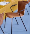
Beauty and function chair by Vico Magistretti for Fritz Hansen
BEAUTIFUL FUNCTION Look at usual things with unusual eyes. Beauty and function converge in a …

Egg chair in Re-wool by Fritz Hansen
NATURAL INSPIRATION THE EGG™ CHAIR IN RE-WOOL Timeless design by Arne Jacobsen in a sustainable …

N02 Recycle by Nendo for Fritz Hansen
Introducing the N02™ Recycle chair from Fritz Hansen N02™ Recycle is a new, all-purpose chair …

Cecilie Manz debuts four rug designs for Fritz Hansen
RUGS BY CECILIE MANZ Danish designer Cecilie Manz debuts four rug designs for Fritz Hansen, …
Fritz Hansen in collaboration with Carla Sozzani – Introducing 16 new colours
Introducing 16 new colours for iconic Arne Jacobsen seating, created by Fritz Hansen in collaboration …
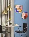
Bold lighting with warm presence and true mystique, Silhuet – Fritz Hansen
SILHUET PENDANT A HAMMERBORG ORIGINAL Silhuet Pendant by Jo Hammerborg The beautiful Silhuet pendant is …

15th Anniversary of Caravaggio by Cecilie Manz for Fritz Hansen
In just 15 years, Fritz Hansen’s Caravaggio™ lighting has gained the status of design icon. …
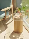
Stub side table by Mette Schelde for Fritz Hansen
MATERIALS MERGE An elegant side table by Danish architect Mette Schelde integrates wood and glass …

The Let™ Lounge Chair by Sebastian Herkner – Fritz Hansen
STAY AWHILE A new, inviting lounge chair by Sebastian Herkner, designed for a wide variety …

Fritz Hansen’s anniversary edition Carimate by Vico Magistretti
An anniversary edition celebrating 100 years of Milanese architect and designer Vico Magistretti Today we …

16 new colours for iconic Arne Jacobsen seating by Carla Sozzani
A SENSE OF COLOUR Introducing 16 new colours for iconic Arne Jacobsen seating, created by …

Alphabet Sofa by Piero Lissoni – Fritz Hansen
Alphabet Sofa™ Series is a flexible sofa concept designed by Piero Lissoni The design, inspired …

The AJ Trolley – A companion table by Arne Jacobsen – Fritz Hansen
A COMPANION TABLE An Arne Jacobsen original designed with elegance and broad function The AJ …

Lily™ 50th Anniversary Edition – Fritz Hansen
LUXURY LIVES ON The 50th Anniversary Edition of Arne Jacobsen’s luxurious Lily™ chair. On the …

Lily™ Chair in Walnut by Arne Jacobsen – Fritz Hansen
LUXURY LIVES ON On the 50th anniversary of the design, Fritz Hansen introduces the Lily™ …
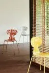
Ant™ by Arne Jacobsen Deco Silhouette – Fritz Hansen
Introducing Arne Jacobsen’s signature stacking chair – Ant™ – for the first time in print …
Aeon is a series of pendants design by Morten Voss for Fritz Hansen
Aeon is a series of beautiful, harmonious and striking pendants This is the first pendant …

Planner™ shelving – Fritz Hansen
The latest addition to Fritz Hansen’s Planner™ collection, our new shelving series embodies forever modern …

Clam by Danish design duo Ahm & Lund @ 3daysofdesign
Ahm & Lund Preview Clam Pendant for Fritz Hansen at 3daysofdesign Clam is a pendant …

Fred Lounge Chair design by Jaime Hayon for Fritz Hansen
The result of the latest collaboration between Fritz Hansen and Jaime Hayon, the JH97chair strikes …

A Drop™ of colour – Fritz Hansen
Sometimes all it needs is a drop of colour to breathe new life into a …

The Little Giraffe™ – Fritz Hansen
Fritz Hansen proudly presents the Little Giraffe™ designed by Arne Jacobsen. The original Giraffe chair …

PK54™ new marble – Fritz Hansen
MAJESTIC MARBLES The PK54™ dining table and the PK61™ coffee table are among the most …

Planner™ coffee table – Fritz Hansen
Original and honest design One of the leading designers of the American design movement from …
See how the Fritz Hansen 60th Anniversary Edition Egg Chair is made
Fritz Hansen celebrated the 60th anniversary of Arne Jacobsen’s Egg chair with a special anniversary …

The POT™ Chair by Arne Jacobsen – Fritz Hansen
Contemporary 50s design from Arne Jacobsen THE POT™ CHAIR We are pleased to reintroduce the …

lala Berlin x Fritz Hansen: a velvet voyage
Fashion Meets Furniture One of the most iconic mid-century classics, the Series 7™ chair, designed …

Lune™ Sofa design by Jaime Hayon for Fritz Hansen
lntroducing a new paradigm in modular sofas Fritz Hansen™ and Jaime Hayon invite lovers of …

Special edition 7™ – Fritz Hansen
Fritz Hansen’s Choice 2017 – the Series 7™ Blossoms in New, Soft Hues Fritz Hansen’s …

Super-Elliptical Table Series – Fritz Hansen™
THE ORIGINAL DEMOCRATIC TABLE GET A MODERN HIGH-TECH MAKEOVER Fritz Hansen has revitalised the Table …

PK22 by Poul Kjærholm – Fritz Hansen
POUL KJÆRHOLM The man behind masterpieces like the PK22™ had a fascination for steel and …
Fritz Hansen — 144 Years of Danish Design, 1872 to 2016
The History of Fritz Hansen: From Craft Workshop to Design Legend Fritz Hansen was founded …
Introducing PAIR™ by Fritz Hansen
PAIR™ is a stacking chair and comes in a mix of veneer and plastic that …

Fritz Hansen – Kasper Salto
Kasper Salto (b. 1967) is a Danish furniture designer whose work for Fritz Hansen has …
Fritz Hansen – Beauty of shapes
Directed by Clemens Poloczek & Lukas Korschan aka Korczek superiest.net Follow on Facebook
Arne Jacobsen & SAS Royal Hotel – Fritz Hansen™
The year 2010 the SAS Royal Hotel in Copenhagen is celebrating their 50th anniversary. We …

Chair Pairs by Benjamin Hubert – Fritz Hansen
FRITZ HANSEN’S NEW STACKABLE CHAIR PAIRS MODERN STYLE AND INDIVIDUAL EXPRESSION During this year’s London …

The Drop designed by Arne Jacobsen in 1958 in new colours – Fritz Hansen
The Drop in new colours The popular chair comes in two new colours; Burgundy red …

The Ant™ designed by Arne Jacobsen in new colours – Fritz Hansen
The Ant™ 9 new colours interpreted by Danish artist Tal R. The Drop™ chair was …

Celebrating the Master of ”Less is More” – Poul Kjærholm
Two of modernism’s most iconic pieces of furniture – the PK22™ lounge chair and the …

VIA57™ chair by design group KiBiSi – Fritz Hansen
The ultimate partnership in Danish design: Fritz Hansen, the Danish architect Bjarke Ingels and the …

Oxford™ A remake of a classic by Arne Jacobsen – Fritz Hansen
Oxford™ – A remake of a classic Republic of Fritz Hansen has created a revitalization …

Pluralis table design by Kasper Salto – Fritz Hansen
Pluralis™ – designed for a modern working life Fritz Hansen presents a new table designed …
Oxford Premium™ by Arne Jacobsen for Fritz Hansen™
Oxford Premium™ is an elegant and iconic re-launch of the classic Oxford™ chair by Arne …

FRI™ easy chair designed by Jaime Hayon – Fritz Hansen
Fri™ is an easy chair designed by Jaime Hayon. Fri™ is designed to create a …

The Scissor lamp design by Christian Dell – Fritz Hansen
The scissor lamp, designed by Christian Dell for the German company Gebr. Kaiser & Co. …

Limited edition of the Swan chair – Fritz Hansen
Fritz Hansen presents a limited edition of the Swan™ chair with a production run of …

7 Cool Architects, a chair and few rules – Fritz Hansen
When Fritz Hansen invited 7 internationally well-known architects to interpret the Series 7™ into new …

PK80 and PK91 in limited edition with Kvadrat/Raf Simons
Fritz Hansen launches fashionable, limited editions from the Poul Kjærholm Collection with Kvadrat/Raf Simons upholstery …

PK80 & PK33 in Canvas design by Poul Kjærholm – Fritz Hansen
Introducing PK80 and PK33 in Canvas For the first time, Fritz Hansen now introduces the …
60 years in perfect shape. Series 7™ – Fritz Hansen
60 years in perfect shape More than any other designer, Arne Jacobsen pioneered the concept …
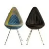
A modern homage on show @ blickfang Copenhagen 2014
MINI and Fritz Hansen present a new take on the legendary Drop chair. A modern …

Copenhagen Room 506 by Jaime Hayon – Fritz Hansen
Introducing Room 506 Together with the Radisson Blu Royal Hotel also known as the iconic …
The inspiration for this Egg™ derives from Arne Jacobsen’s use of classic bluish colour tones – Fritz Hansen
Egg™ – Fritz Hansen Choice 2014 The inspiration for this Egg™ derives from Arne Jacobsen’s …

Analog design by Jaime Hayon – Fritz Hansen
Analog – the new table from Jaime Hayon is now available Analog™ is celebrating the …

Grand Prix™ in wooden legs design by Arne Jacobsen in 1957 – Fritz Hansen
Grand Prix™ The Grand Prix™ Chair was designed by the Danish architect and designer Arne Jacobsen in …
The Drop chair by Arne Jacobsen – Fritz Hansen
The Drop™ chair was designed by Arne Jacobsen in 1958 as part of his masterpiece, …
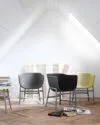
Minuscule Chair by Cecilie Manz – Fritz Hansen
The Minuscule Lounge Chair by Cecilie Manz for Fritz Hansen won the ICFF Editor’s Award …
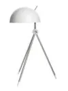
Radon White by Hans Sandgren Jakobsen for Lightyears
Hans Sandgren Jakobsen’s Radon, on its characteristic three legs, was introduced by Lightyears in 2005. …

The Golden Egg 50th Anniversary in Limited Edition by Arne Jacobsen
The world famous Egg chair designed by Danish Architect Arne Jacobsen in 1958 and manufactured …
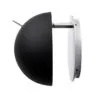
Radon Wall by Hans Sandgren Jakobsen for Lightyears
The fundamental geometric forms – the circle and the triangle – are key elements in …

PK25 as a special version in black halyard by Poul Kjærholm – Fritz Hansen
Poul Kjærholm’s furniture design has a special place in Fritz Hansen’s heart Fritz Hansen now …

Radon by Hans Sandgren Jakobsen for Lightyears
Universal construction through geometric fascination The fundamental geometric forms – the circle and the triangle …
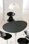
Arne Jacobsen 100 Years – Centenary Package
Arne Jacobsen, architect and designer – would have turned 100 this year 2002 marks the …

Swan sofa by Arne Jacobsen is now being relaunched
WELCOME BACK TO ARNE JACOBSEN’S SWAN SOFA! After 25 years of hibernation, the Swan sofa …

